Information graphics, or infographics as they are more often called, are a great way to convey complex information clearly and concisely. Infographics can be anything from annotated maps, timelines, flowcharts, graphs, Venn diagrams, size comparisons, charts, or data presented with snazzy typography to a gorgeous amalgamation of several of these techniques. They add visual interest to your blog and are passed around more often than ordinary images or text.
If you have a design background or are fortunate enough to have some artistic skill, you can create your own infographics from scratch. If you’re like most of us, you’ll need a bit of assistance; fortunately, there are plenty of helpful resources online. Here are a few:
- Visual.ly is like a search engine for infographics, so if you’re looking to use a graphic created by someone else (with permission or by Creative Commons and with attribution, of course), you may well find what you need here among the thousands of beautiful options that have already been created. They’re also working on a tool that will allow bloggers and others to create their own infographics using a plug-and-play system.
- IBM’s Many Eyes gives you access to libraries of data and the ability to upload your own. It’s straightforward and yields professional looking results.
- Google Public Data allows you to use publicly available data to create attractive infographics in a variety of forms.
- Wordle makes it extremely easy to turn text into eye-catching word clouds with customizable fonts, colors, and designs.
- Stat Planet lets you create interactive maps and data visualizations using simple browser-based tools and built-in data from sources such as the World Health Organization, CIA World Factbook, Wikipedia, and more.
- If it’s simple, elegant, easy-to-customize charts you’re looking for, Hohli might be your answer.
- Creately is a good option if you’re working with flow charts or diagrams but does cost $5 per month or $49 per year (USD).
Now let’s take a look at some striking examples of how infographics were used to illustrate and enhance posts about last month’s most-blogged-about stories (according to Regator.com, these were: Hurricane Irene, Steve Jobs, London Riots, Libya, Labor Day, the GOP candidates, earthquake, September 11, Federal Reserve, and Motorola Mobility) and get ten quick tips on choosing or creating infographics for your blog…
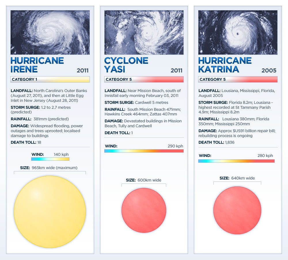
Do your research. If you’re creating your own infographic, start with a solid foundation of research. This infographic comparing Hurricane Irene with two other storms is visually simple but is based on solid research.
Cite your sources and be transparent. This infographic on Steve Jobs features an extensive list of sources in the footnotes and in doing so, allows viewers to fact-check and determine the reliability of the sources used.
Promote your blog. It takes a lot of effort to put together an attractive, well-researched infographic, which is why visualizations, like this one about the London Riots, often feature a prominent link or logo near the bottom indicating the creator. If you do make your own infographics, rather than keeping them solely for yourself, use them as an opportunity to spread your blog’s brand by tagging them with your logo and allowing them to be embedded around the web, preferably with an embed code that leads back to your site.
Get interactive. If you have the resources, interactive graphics such as this timeline of Middle East protests is just about the most engaging content you can provide. These, obviously, require a great deal of expertise and skill, but when done right, are a stunning way to provide a large amount of information.
Choose a color scheme. Choose a color palette that is complementary, striking, and able to tie elements together to create a cohesive look. This Labor Day infographic is a great example of color done right.
Give credit where credit is due. Before hosting an infographic on your blog, be sure you have the rights to do so. Check for Creative Commons License information (see the CC logo at the bottom of this infographic on the 2012 GOP candidates) or other licensing information and if an embed code featuring a link back to the source is provided, as it is here, be sure to use it.
Do one thing and do it well. Define your focus and make sure that the information you’re presenting is relevant to your point and not simply pretty to look at. This map of Twitter activity during a recent U.S. earthquake presents only one kind of information but, in doing so, paints a clear picture that can be understood in an instant.
Lead the viewer’s eye. This infographic on travel ten years after September 11, 2001 makes effective use of lines and graphics to pull the viewer’s eye down the page and onto the next piece of information. Pay attention to where you want viewers to look, especially in flow charts, and use design principles to get them there.
Use minimal text. Some text is necessary to convey your point, but the beauty of infographics is that they allow you to minimize text while still conveying extensive information or complex concepts. You want your infographic to look more like the top half of this Federal Reserve visualization than the bottom half, which is attractive but text-heavy.
Keep it short and simple. This comparison chart of Google and Motorola is short and sweet but tells the story. Use only as much data and information as you need to make your point and no more.
Do you know of other ways to find or create infographics? Please share them in the comments.
Kimberly Turner is a cofounder of Regator.com, Regator for iPhone and the brand-new Regator Breaking News service for journalists and bloggers. She is also an award-winning print journalist. You can find her on Twitter @kimber_regator.


